MOUNTAIN WATER FROM
LIQUID DEATH
Recently launched water brand Liquid Death is paving the way as the most environmentally friendly mineral water, and they’re doing it in epic style! The branding is bold and brave – and we have to say we’re big fans!
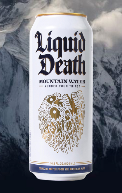
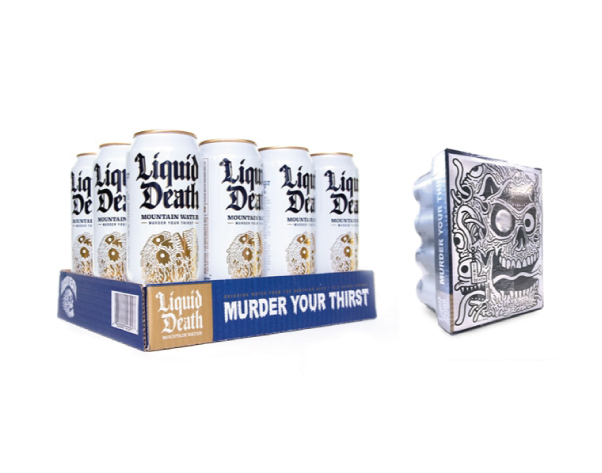
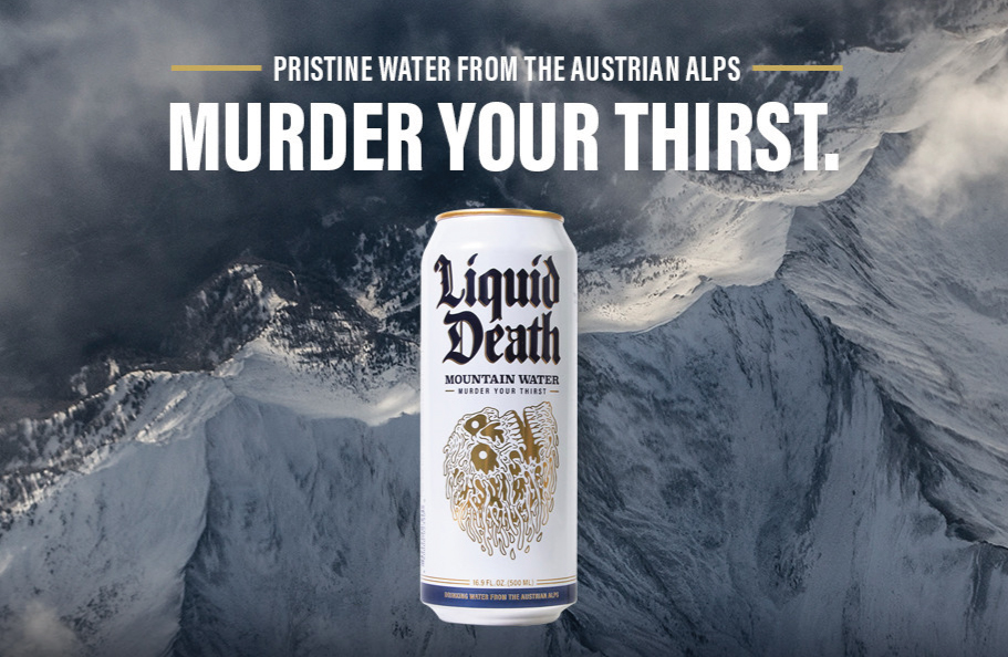
Using cans instead of bottles instantly makes Liquid Death the most environmentally friendly water brand on the market, and they’ve decided to stand out even more with their edgy branding and can design. The skull illustration and a metal/grunge inspired typeface mean the cans could easily be mistaken for a beer can or an energy drink. Plus we love the slogan ‘Murder Your Thirst’ boldly emblazoned across the side of the box and the additional illustration on the bottom – just the kind of branding attention to detail we favour.
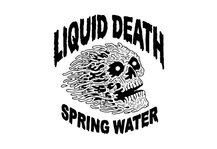
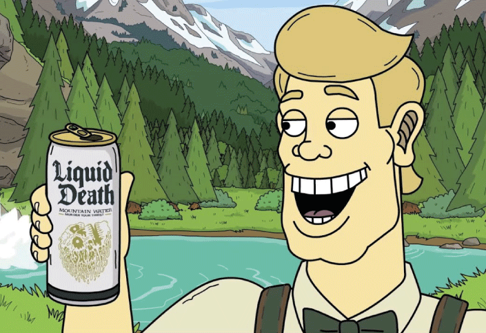
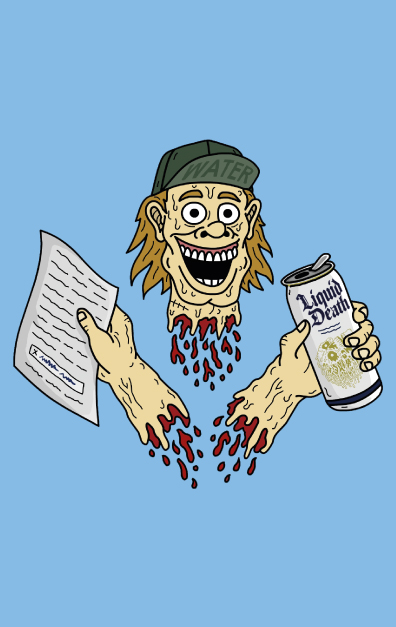
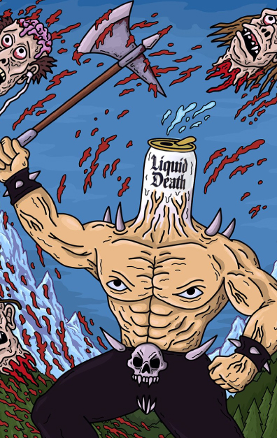
To accompany their can designs Liquid Death have created a number of memorable illustrations, and also an animated video. They’re bold and over the top – it’s always good to see brands shaking up what’s expected within their industry. And it’s no surprise when you learn the brand is the brainchild of Mike Cessario from a background in advertising and marketing, Pat Cook – a heavy metal bartender, manufacturing expert JR Riggins and animator Will Carsola – best known for Adult Swim’s Mr Pickles (source: Creative Bloq).
