Power Flower
THE GOOD LIFE SUPPLEMENT CBD OIL
PACKAGING DESIGN & BRANDING
FEBRUARY 2019
A new to the market CBD oil with the tagline ‘The Good Life Supplement’ – Power Flower. We created their complete brand identity. The client briefed us that they wanted an identity created that had a high-end feel, and with none of the visual connotations of the cannabis recreational market.
Visually we wanted to create an identity inline with the luxury product market, particularly taking inspiration from the cosmetic and food fields. We led with the idea that the brand should feel natural with a minimal and stylish edge.
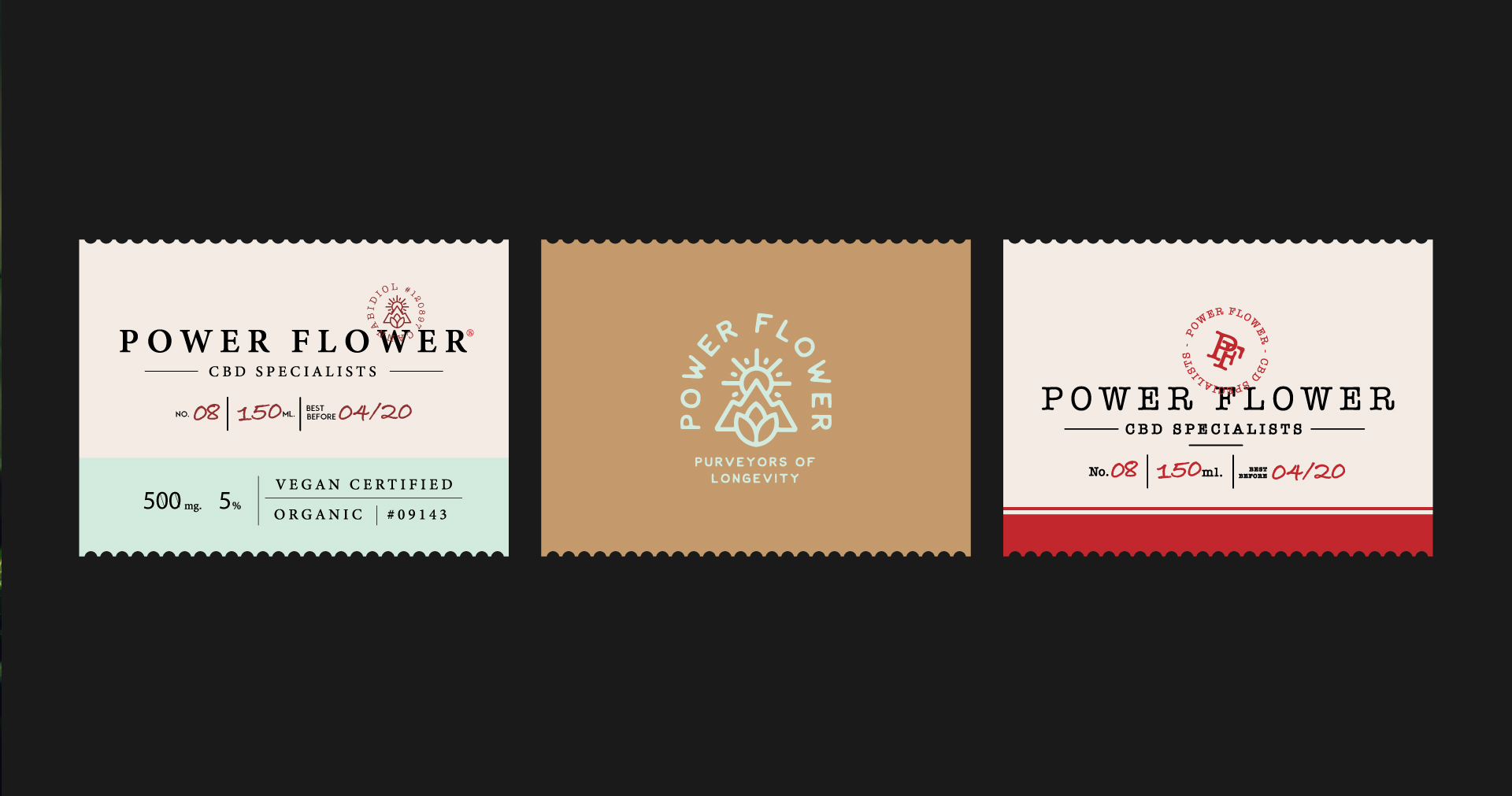
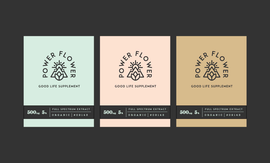
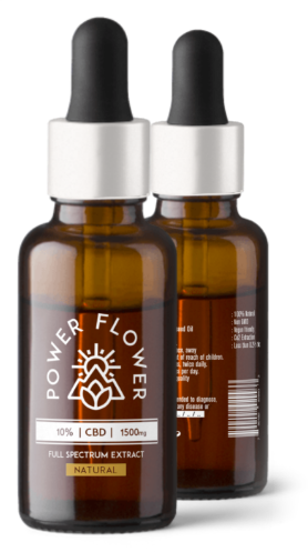
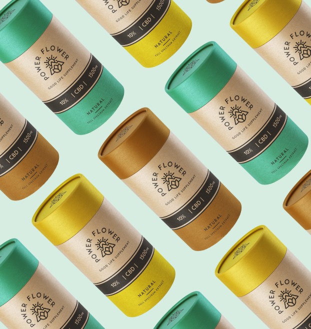
We spent a lot of time working with the client in the packaging research phase, this gave us great insight into how the brand would be applied and the requirements to consider throughout the brand creation. The chosen packaging has a natural feel to it through the use of recycled containers and glass bottles, further reinforcing the natural yet minimal feel to the brand and it’s natural connotations.
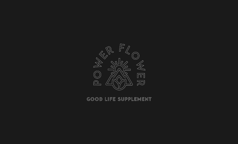
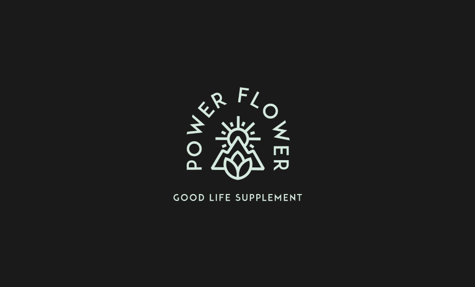
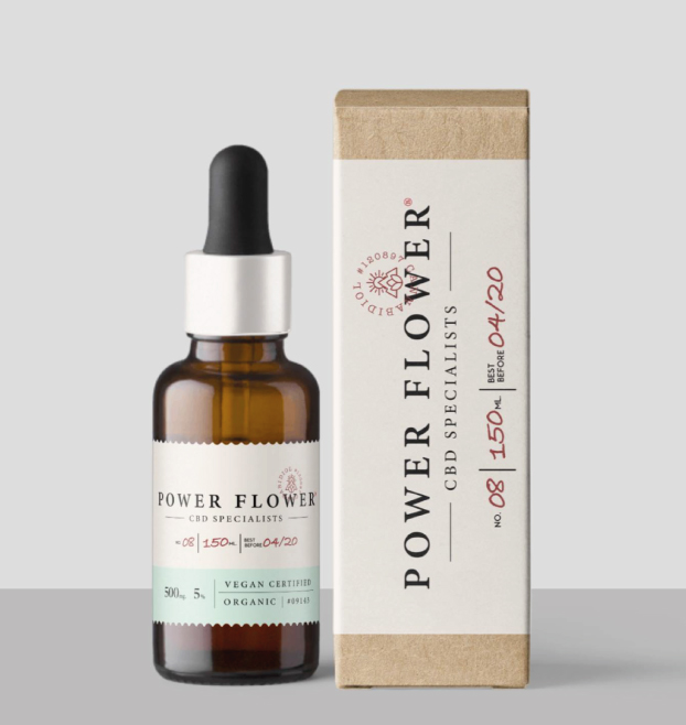
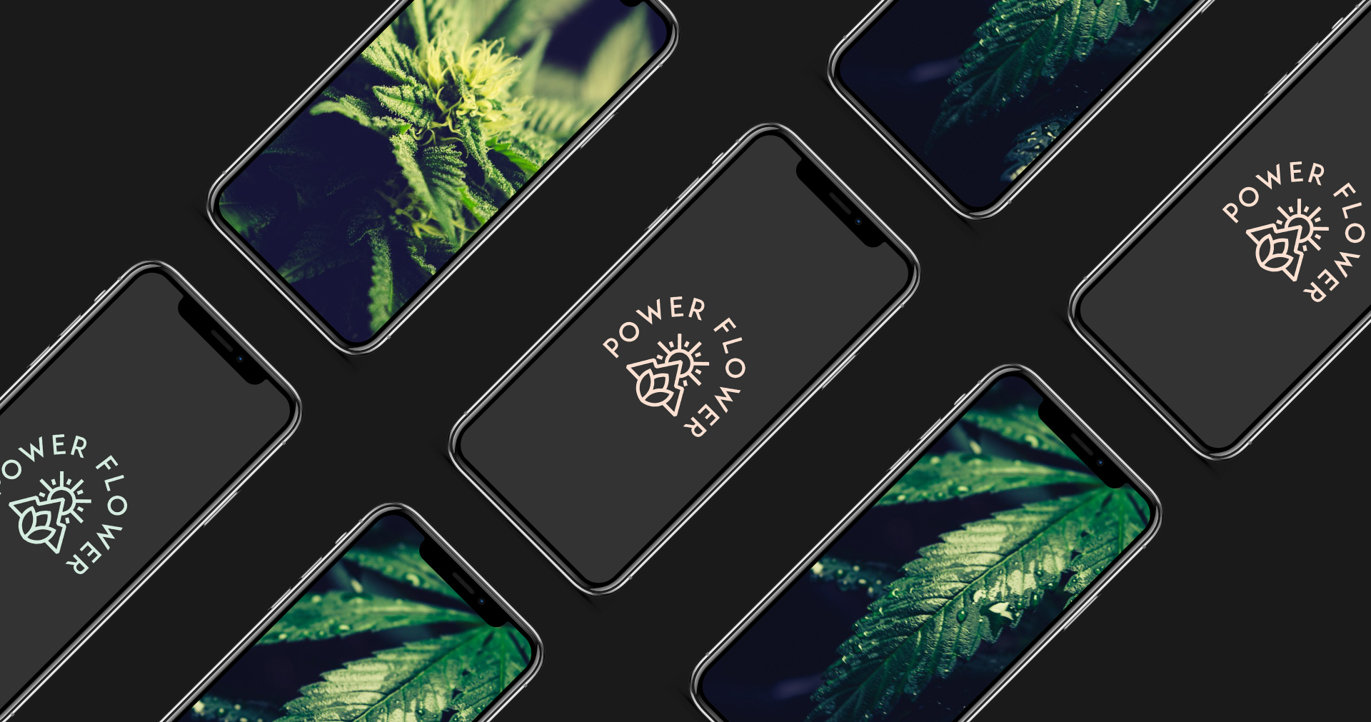
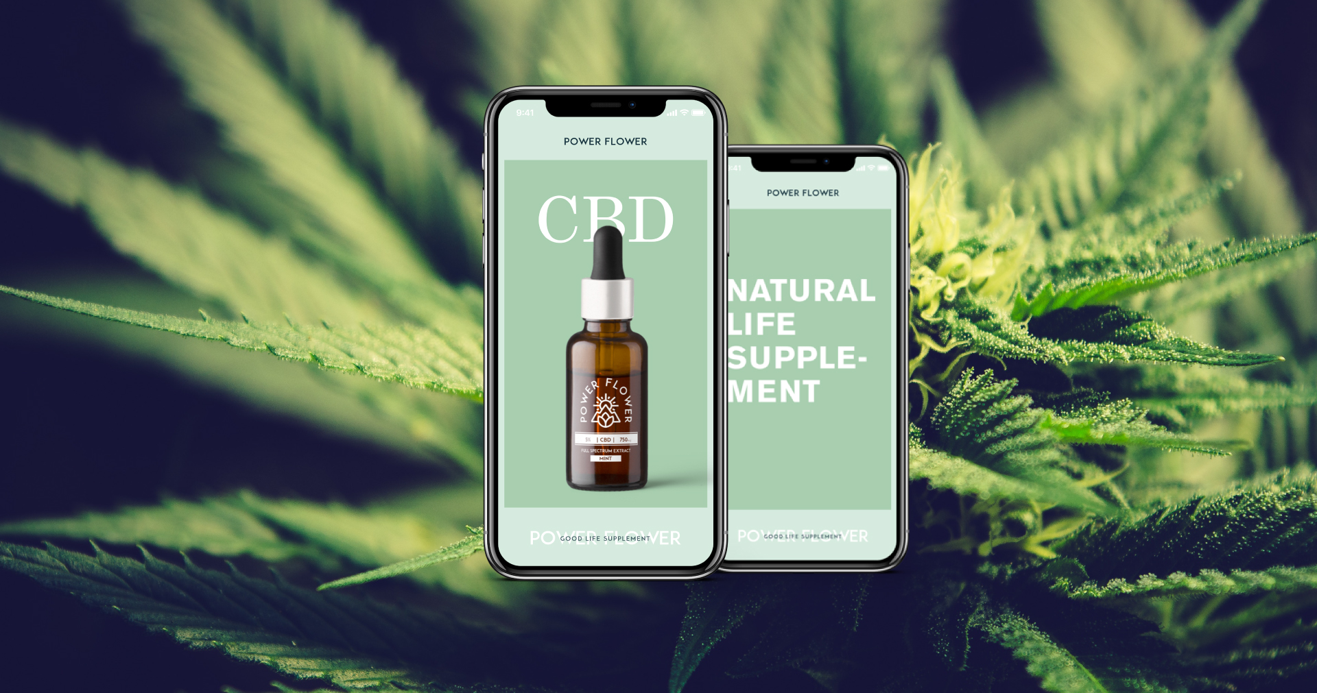
To bring Power Flower to life we created a logo based around a sans-serif typeface and a custom icon blended together, assigned colours and typefaces, designed the packaging; both the stickers to go on the bottles and the design for the containers that the bottles sit in and created artwork content for use as part of their social media campaign.
When creating this brand it was important to consider the many applications for the logo, not just now but in the future. We created a versatile logo that works across various different mediums; from packaging to use on digital interfaces.
Power Flower recently launched and is available to buy in the UK in three different flavours (classic, mint and lemon), you can follow their journey on Instagram here and their website here.