PTFS EUROPE
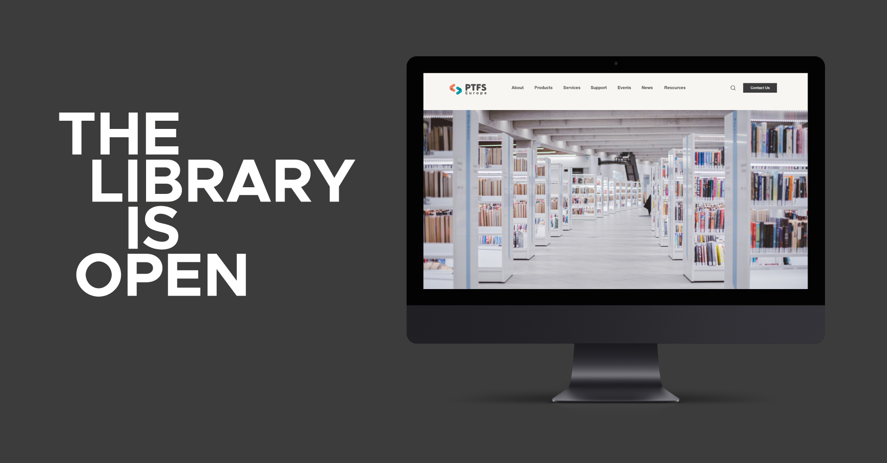
THE LIBRARY IS OPEN
REBRANDING & WEBSITE DESIGN & DEVELOPMENT
SEPT 2022
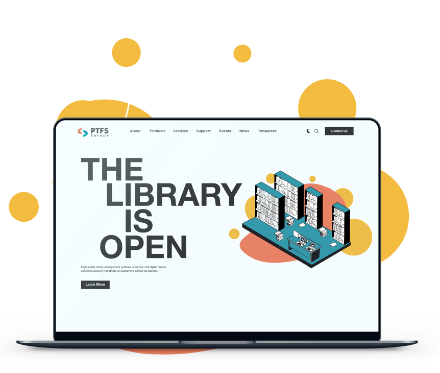
PTFS Europe has been leading the way in open source library software since 2007. We worked with them on a complete rebrand that included the design and build of a new website to reflect their core values of community, open communication and innovation.
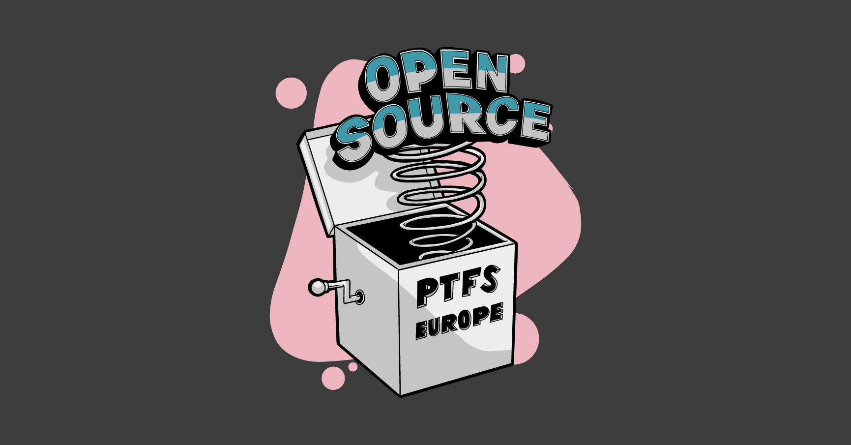
PTFS Europe wanted their identity to be engaging and forward thinking, yet still personable and friendly. Illustration, bespoke iconography and colour use across all marketing assets and the website achieves this. The rebrand centered around the creation of a new logo, associated colours and typefaces, as well as full corporate guidelines and print materials design. Their new website was custom designed and built using WordPress as the CMS.
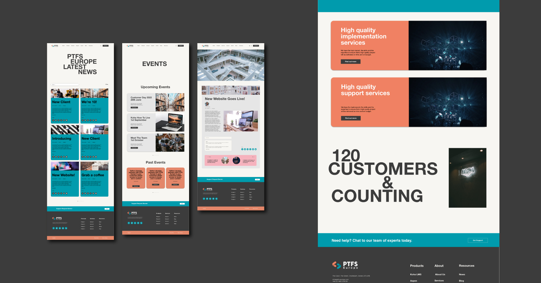
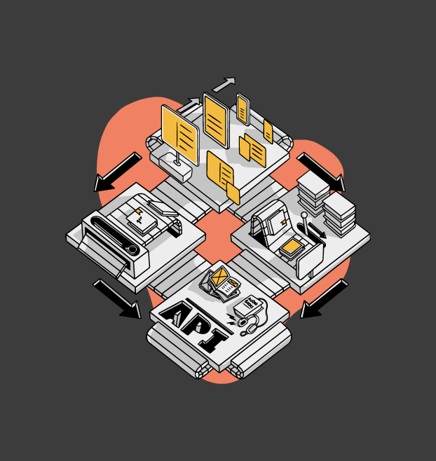
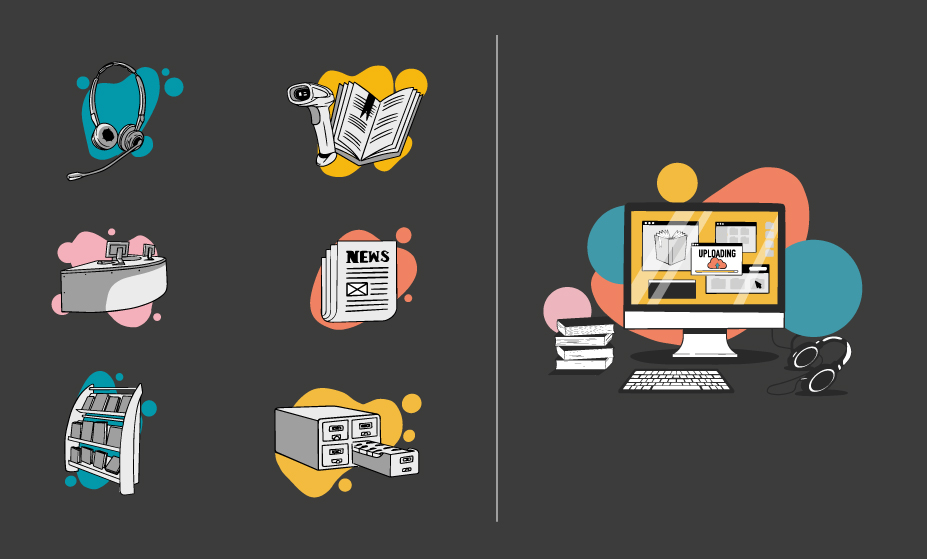
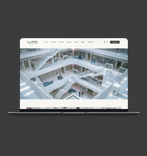
Various concepts were developed, with the finalised concept feeling like a natural evolution from their existing branding. Their logomark works as a stand alone, recosnisable icon and the bold colour palette reflects the various different areas of their business. In an effort to step away from a reliance on stock photography, custom illustrations were designed as a core part of their brand identity. The distinctive library scene is the foundation of the website header with individual illustrations defining core services.
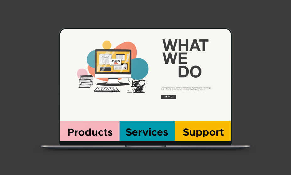
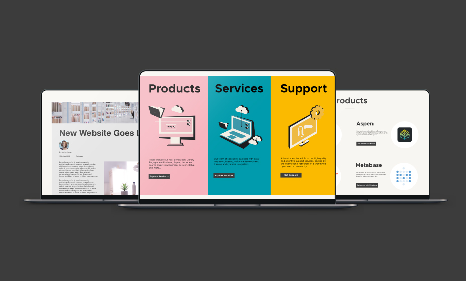

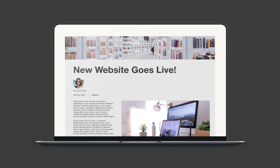
UX was a core consideration for the website design. Previously they had just the one blog area housing a vast array of content, we split this up into different sections: news for shorter, snappier, company based posts, support for more technical posts related to each of their products, events and blogs for longer think pieces and white papers. We also added on a fun element in the form of light and dark mode reflective of a library during the day vs. at night.
Our relationship with PTFS Europe is ongoing, and we have just completed a newspaper design for them inplace of a standard brochure to ensure they continue to stand out from the crowd.