When approaching the creation of their brand identity we discussed with The Insurance Supermarket team their target market, their visions for the brand, their competitors and their growth plans.
This provided us with a solid grounding to develop the identity, one that would work now and also have longevity.We developed a concept for the company where we created a virtual supermarket to be their brand identity. Within this their services would be the products and we would create graphics associated with their brand that further reinforced this message.
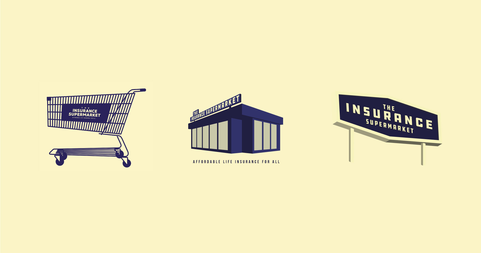
To successfully deliver this and create something that was instantly recognisable as a supermarket we spent time researching the industry, the core visual elements that make up most supermarket branding and the typical items you would find in a supermarket environment. A few key components came to the forefront from this, these notably being bold typefaces, strong use of colour and implementation of tag lines.We wanted the logo to form the structure for the brand, the store front. So, we designed a logo that encompassed all of this, cleverly implementing a typeface within a building structure.
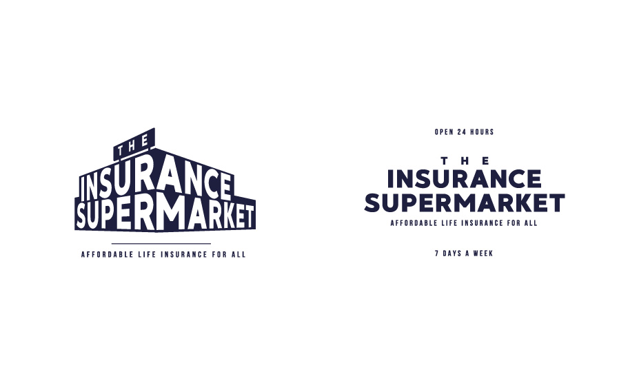

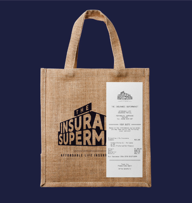
A brand identity is not just made up of a logo, it’s all the elements that make up the feeling of a brand – there should be a consistency across all mediums where your brand is displayed, from flyers to a website. To achieve this we applied a colour palette and suite of three typefaces to the brand, each with their own individual uses to be adhered to.
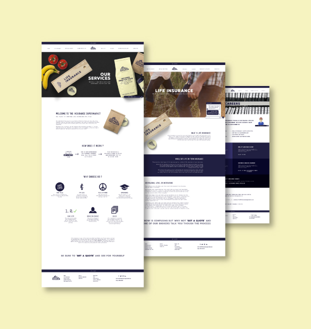
To further reinforce the supermarket feel to the brand we created some custom graphics to be used on the website, but that could also be used in marketing campaigns and social media. These included; a product for each service, a shop assistant, a receipt for purchases and The Insurance Supermarket trolley.
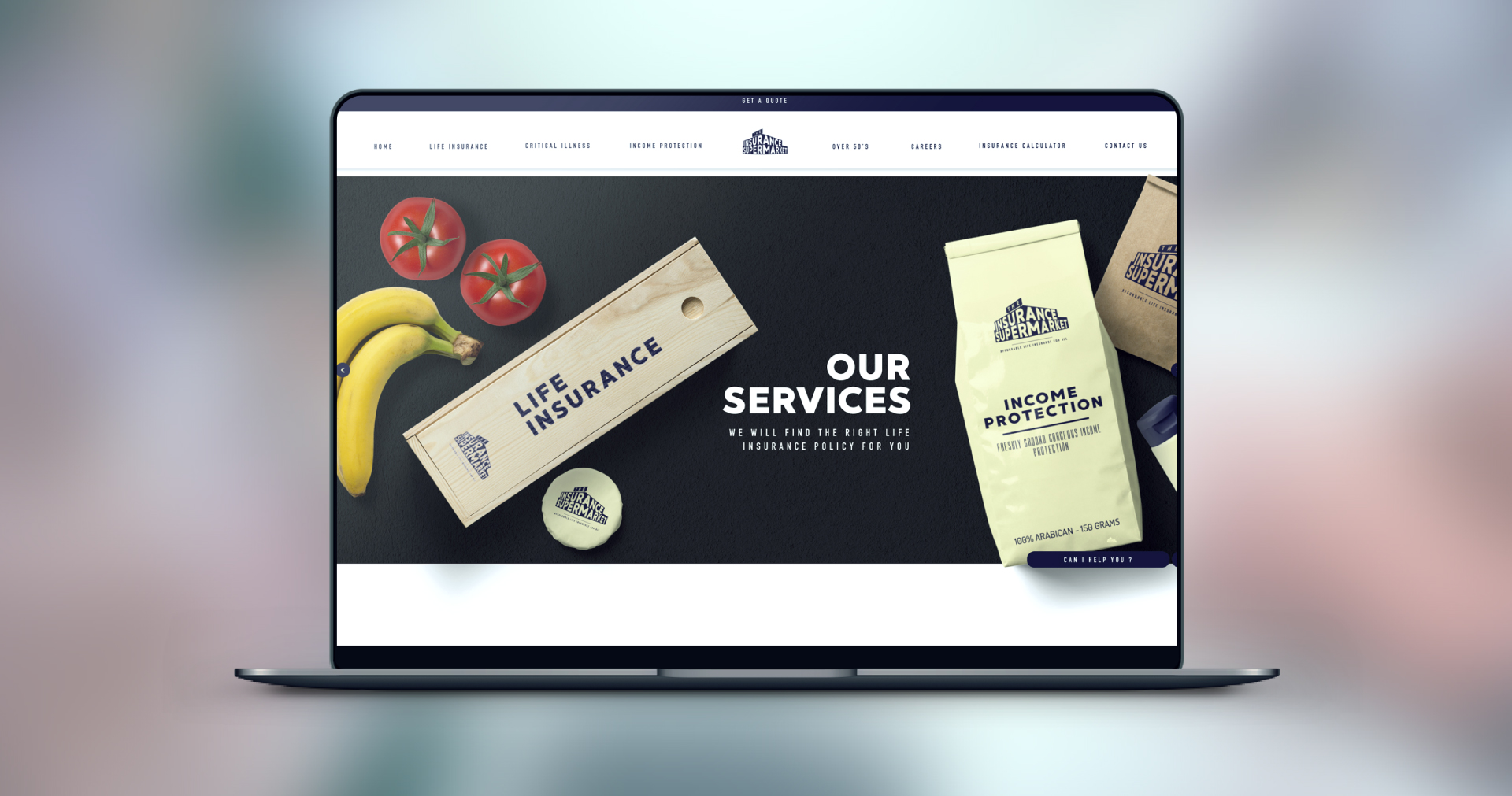
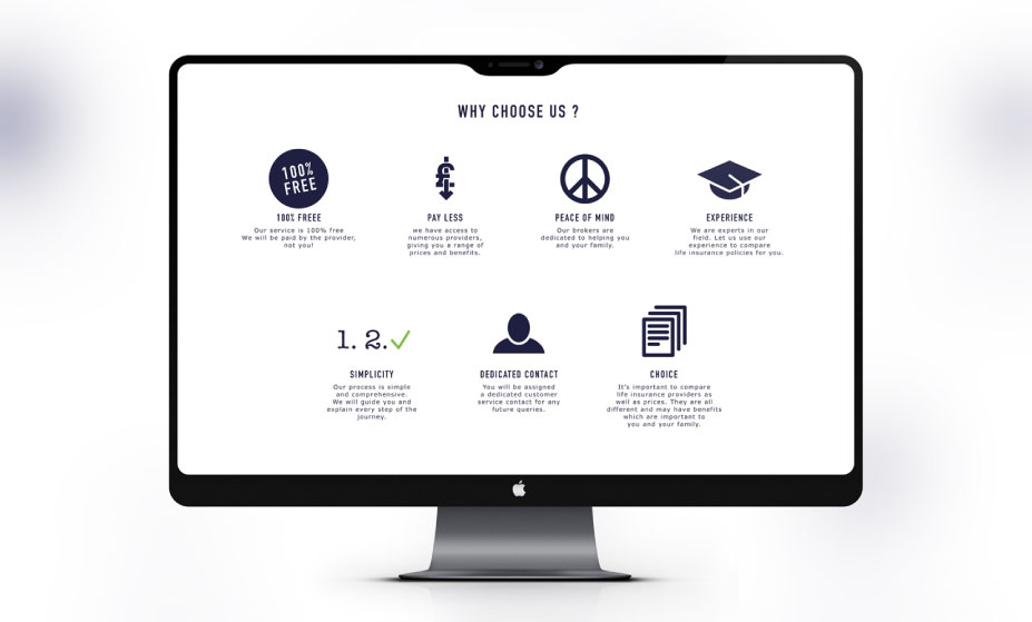
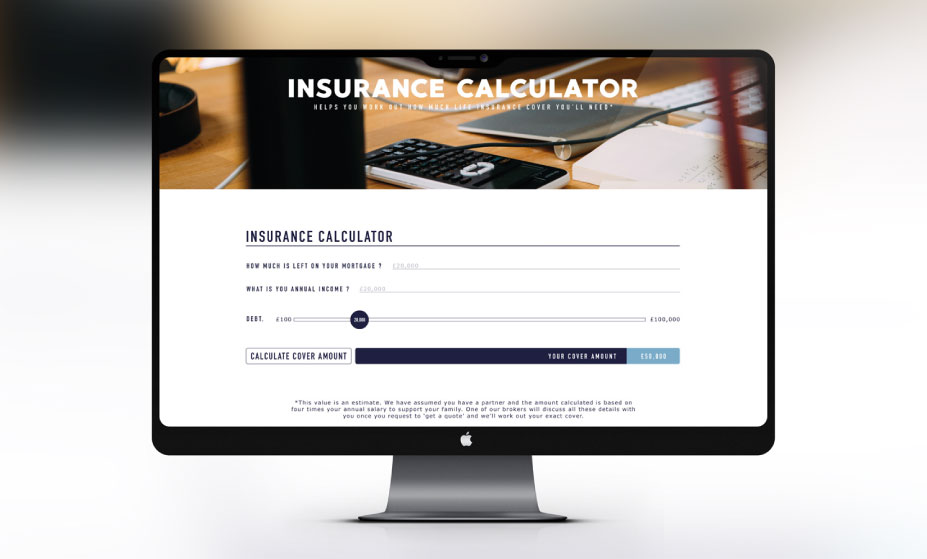
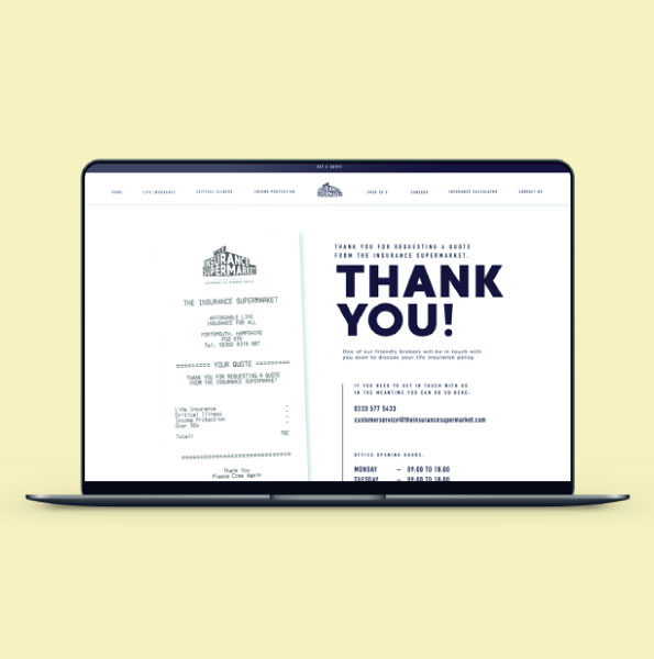
Once the brand identity had been created the next stage was to bring the brand to life through a website. The website formed the primary sales tool for The Insurance Supermarket so it was vital it provided an enjoyable user experience whilst reinforcing their brand and invoking confidence in their service. The website delivers quite a corporate message through its content and it was our job to convey this in a fun way through creative elements such as the conveyor belt homepage slider, the live chat shop assistant and the thank you page with receipt for customers ‘purchases’.
View the website here.
